
Geelong Performing Arts Centre
Brand IdentitySoftware ︎
Adobe InDesign
Adobe Photoshop
Adobe Illustrator
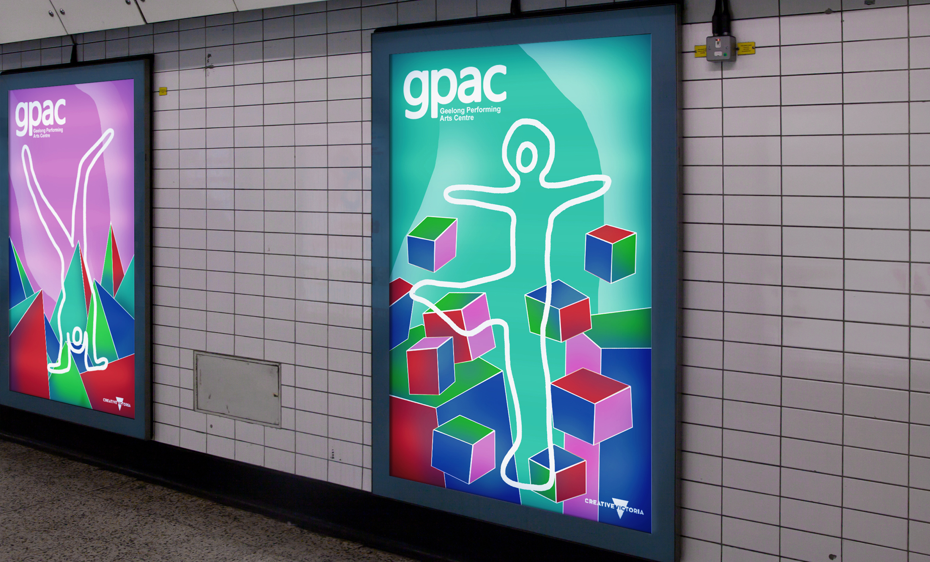
The aim of this project is to establish a new visual language that matches the vibrancy of the new revitalisation of the Geelong Performing Arts Centre which will invigorate the location of downtown Geelong and the new brand positioning. The final design uses a bold colour palette inspired by the red and purple tones of lighting and theatre atmosphere, chosen purposely to draw the attention of the viewers in, presenting more opportunity for viewers to be enticed by GPAC’s offerings.
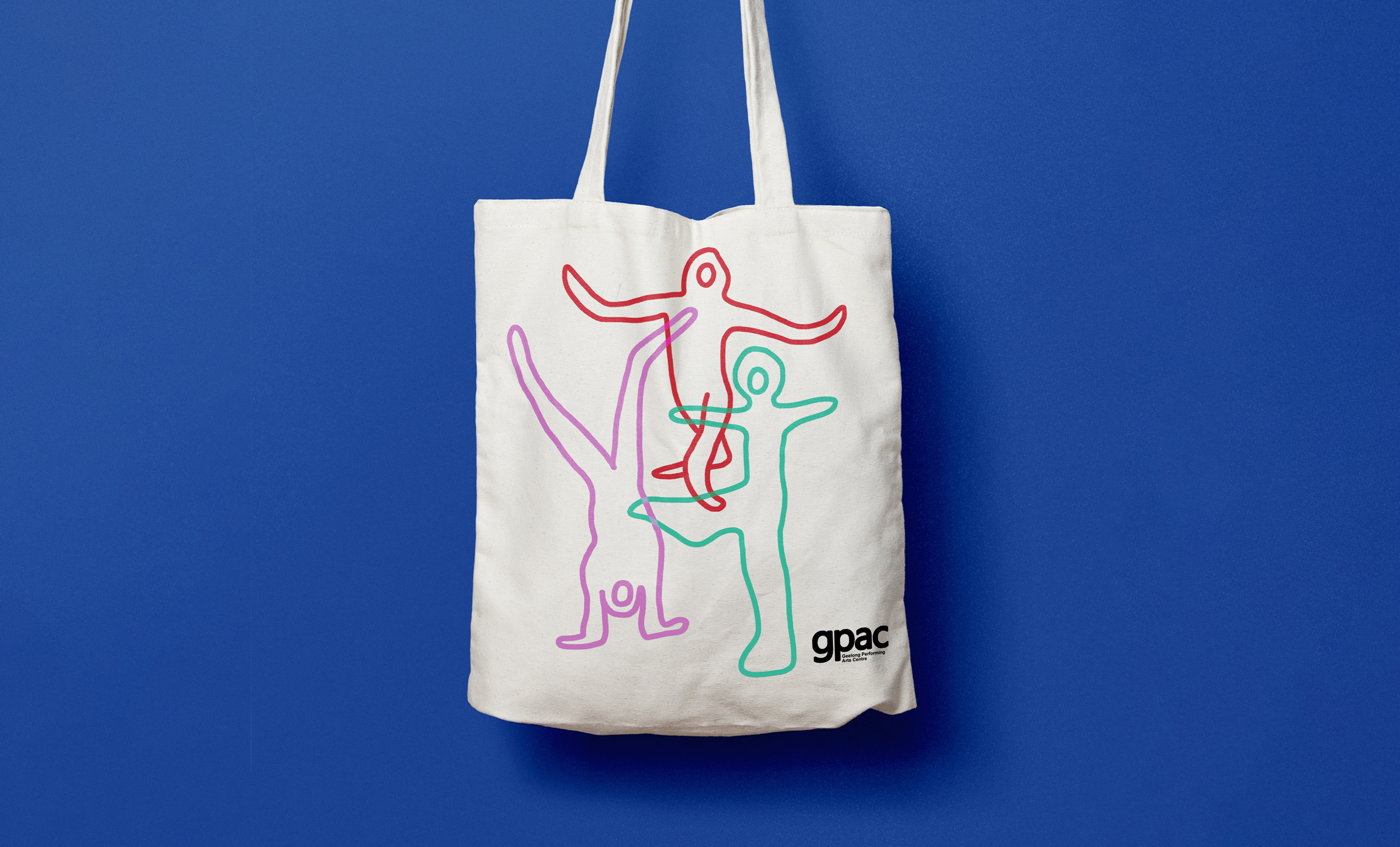
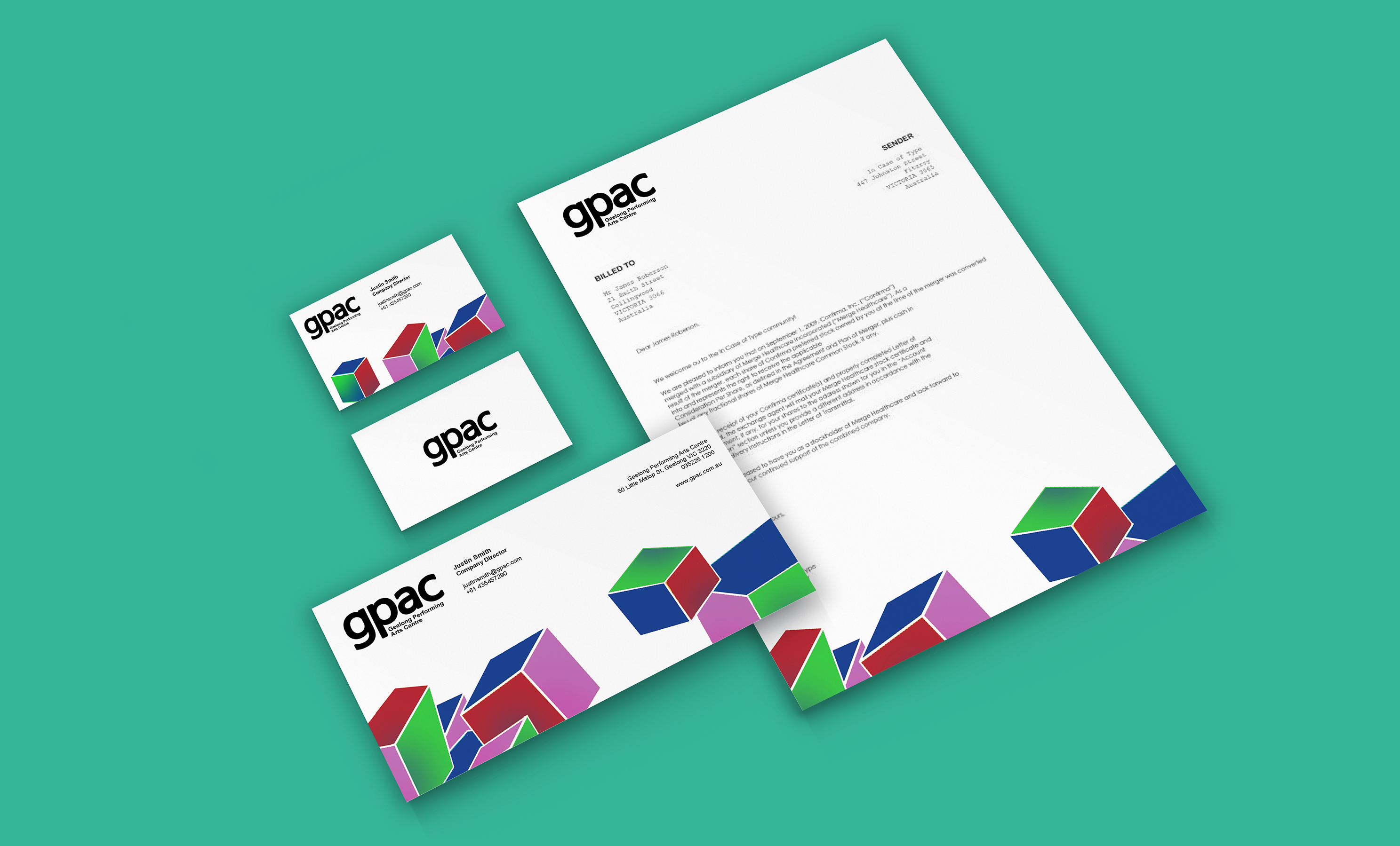
Quirky isometric shapes are used sparingly throughout visual language to depict the renowned artistic energy & vibrant nature the of arts centre. The shapes are unique and will help visitors visually associate the GPAC brand.
Designed by Kyōko Louise.
Quirky isometric shapes are used sparingly throughout visual language to depict the renowned artistic energy & vibrant nature the of arts centre. The shapes are unique and will help visitors visually associate the GPAC brand.
Designed by Kyōko Louise.